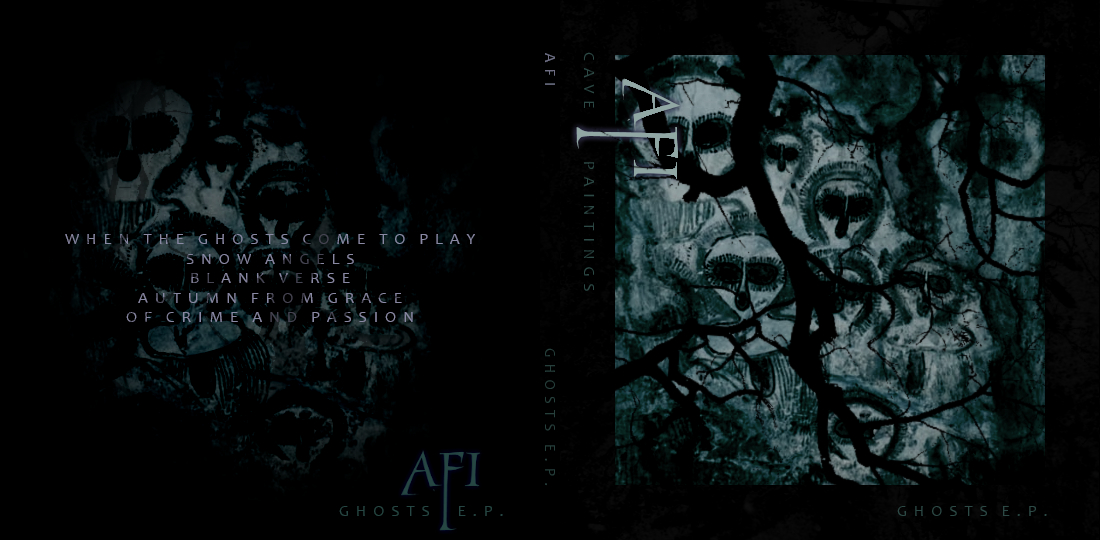
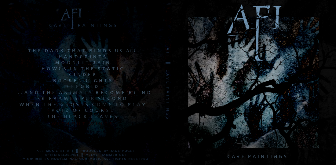
Over several years, as a hobby, I used to just come up with song titles for different bands, and make fake tracklists for non-existant albums… kind of as a (very) simple exercise in creative writing. After maybe 3 different iterations of doing this with AFI tracklists over different periods, I decided to kind of take some of the best titles and make actual album art for such a non-existent album. I basically have an idea of what each one of these songs sounds like - various styles they’ve done in the past, like something more post-punk leaning, new-wave, punk rock, ballads, and so on. And there seemed to be a reference in all of the titles to being in the dark or silent, being primal, nature and even some pagan elements, but also making art… so I settled on an album title of Cave Paintings. There’s some classic AFI elements in some of the song titles (Leporid, Cinder, 16 Frames Per Second - a metaphorical reference to silent film -, among other things). And of course the first track would be a classic intro. (And there’s even a hidden track! canyoufindit? So technically there are  13 tracks. Nice.)
The artwork is mainly based on a picture of Cueva de las Manos (Cave of Hands) located in Santa Cruz, Argentina - cave paintings that are dated to around 10,000 years ago, which tie into the album title and also the title of the 2nd track Handprints This has been overlaid with shadowy tree branches and such, and the coloring has been adjusted so there’s sort of a dark black/blue and brown color scheme to tie the whole thing together. I also tried my hand at what I thought would be a pretty neat AFI logo… kind of reminiscent of the DU logo meets the StS logo, but with a definite new flair. Also, as you can see on the back art, I sort of merged the title and logo together for one more cohesive Cave Paintings logo (that would presumably be used for merch or something).
If there’s interest, I could explain some of my thoughts about each one of these imaginary tracks, what kinds of sounds they might have, lyrical meanings, and even some of the track titles that didn’t make the cut.
Clearly I’ve put too much thought and effort into this, but really it was a fun way to kill some time over a period of months (or years). I have little to no graphic design background (I do have a background in some traditional art and am a UI/UX developer), so I’m pretty proud of how this turned out and just wanted to share it with others who might appreciate this sort of thing.
All the malarkey on the back with like copyrights and production credits and whatever is just that: malarkey. But I wanted to include it for layout purposes, and I guess it could make a fun April Fools joke if AFI news HQ still does that sort of thing.