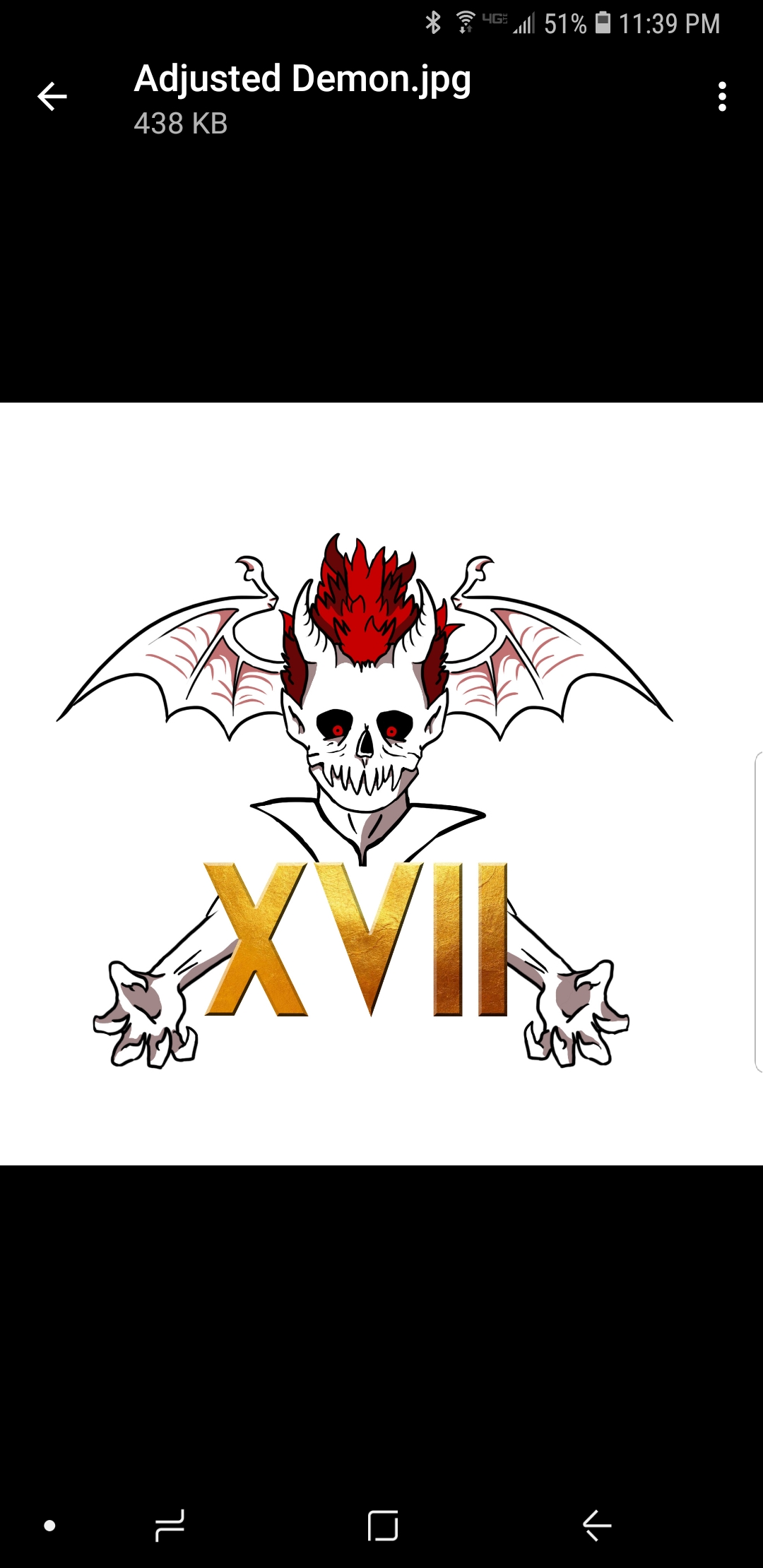
This is a design I’ve been having my graphic designer work on. It is to celebrate 17 years of the Despair Faction. Let me know what you think.
4 Likes
I like it! Not 100% sure about the font for those Roman numerals, but I like the rest of it!
1 Like
I really don’t like the font/colors of the Roman numerals and I feel like the head+numbers+arms should be a bit more spaced out? I really like the design of the head, though! Especially the eyes.
2 Likes
Agree…don’t like the roman numerals but the rest looks really nice 
1 Like
Make the arms connect to the shoulder please.
2 Likes
I think the Roman Numerals should be darker and in a style inspired by Tim Burton.
3 Likes
Definitely agree with the numbers being darker… Other that I think it looks great!!
i agree with @sayasha on the font, and it being daker, but otherwise, it’s really dope! <3
1 Like
I submitted to have a few changes made, including lowering the wings, which I agree with.
2 Likes